What is Ektar 100?
Created and sold by Kodak, Ektar 100 is a low-speed, daylight-balanced color negative film with an ISO rating of 100. It is known for exceptional sharpness, strong edge definition, vivid color, and extremely fine grain. According to Kodak’s datasheet, Ektar 100 “offers the finest, smoothest grain of any color negative film available today.”
Ektar is also widely known for its bold color and high saturation. It tends to emphasize reds, blues, and greens, giving photographs a rich, polished appearance. Because of its slower speed, it performs best in bright daylight or controlled lighting where there is enough light to maintain a comfortable shutter speed.
It is especially well suited for landscapes, architecture, travel, nature, fashion, product photography, and scenes where detail and color accuracy matter more than flexibility. Its strong saturation can make skin tones appear warmer or redder than expected, so it is often better suited to scenery and objects than to portraits. This film is available in 35mm, 120, and 4×5 sheet-film formats and is processed using standard C-41 chemistry.
Shooting The Roll
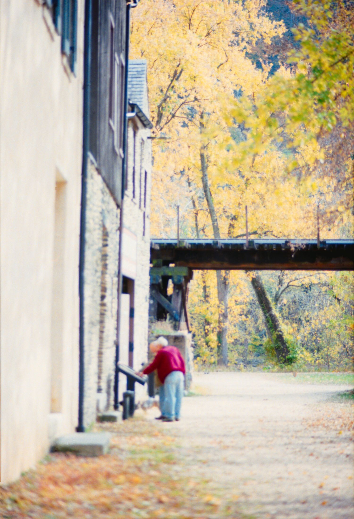
I’d been holding onto a roll of Ektar 100 for a while. I had been saving it intentionally for the fall since I’d seen how it over and made fall leaves and autumn colors pop. Harpers Ferry is a quaint, historic town in West Virginia that has some scenic hiking trails that run along the Potomac and Shenandoah Rivers.
Knowing this, I figured it would be a perfect time to test out Ektar 100 for the first time since we'd be surrounded by nature and have accessible views of some fall foliage. Parking was hard to find, so we ended up parking way up on the hill. It ended up being a really beautiful fall day. We ate at Coach House Bar & Grill, which was pretty good, popped into a few gift shops, and spent some time walking the streets.
I’m always a little nervous when shooting a new film stock for the first time. There are so many expectations built up from seeing how good other people’s results look online, and with Ektar 100 being a bit pricier than my usual go-to films, the pressure felt even higher. On top of that, fall was quickly coming to an end, so I didn’t have much time left to keep putting off shooting this roll. Eventually, I realized I just had to load the film and trust the process, even if it didn’t turn out exactly how I imagined.
By the time we made it back to the car, I had finished the entire roll of film. I was a little worried I had rushed through my shots and wasn't intentional enough but then again, I was really just testing out the roll to see how it performed and how I liked the results.
The Look: Grain, Contrast, and Character
Final Thoughts
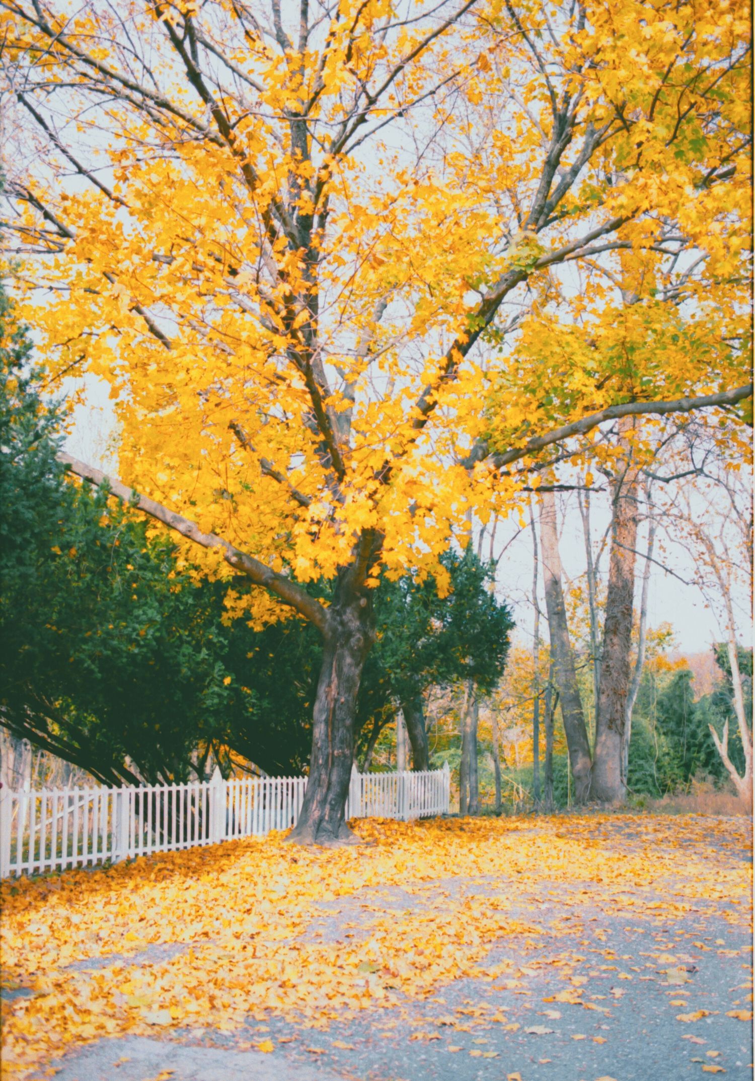
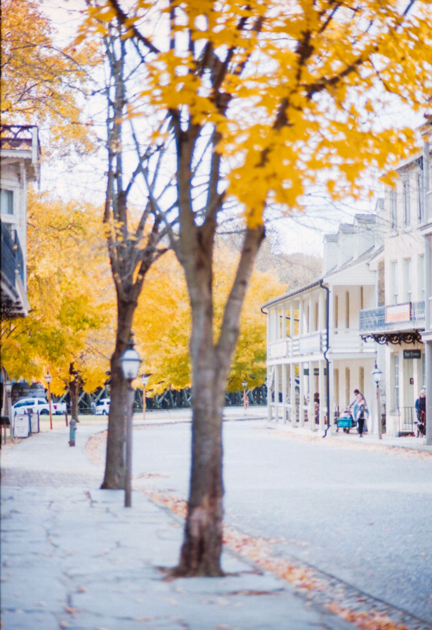
Kodak Ektar 100 is definitely the perfect film for fall. Its bold saturation brought out the yellows, oranges, reds, and greens in a way that made the autumn scenery feel especially vivid. The fine grain and sharp detail also worked beautifully for trees, architecture, mailboxes, and other subjects with strong color and texture.
Since it's an ISO 100 film, it works best when there is plenty of light and may feel limiting in darker or quickly changing conditions. It also requires careful scanning and editing to keep bright skies and white buildings from looking washed out. Still, when used in good daylight, Ektar creates rich, polished images with the kind of bright color I was hoping for.
I would absolutely shoot it again for fall foliage, travel, landscapes, architecture, and any scene where saturated color is part of the story. It would not be my first choice for every situation, but for bright autumn colors, it is difficult to beat.
- Extremely fine grain and a clean overall look
- Bold yellows, oranges, greens, and blues
- Strong detail in architecture, foliage, and small textures
- Sharp edges and good definition in buildings and mailboxes
- Beautiful results for autumn landscapes and travel scenes
- Saturated color gave some images a polished, postcard-like quality
- The negatives gave me room to create different looks through scanning and editing
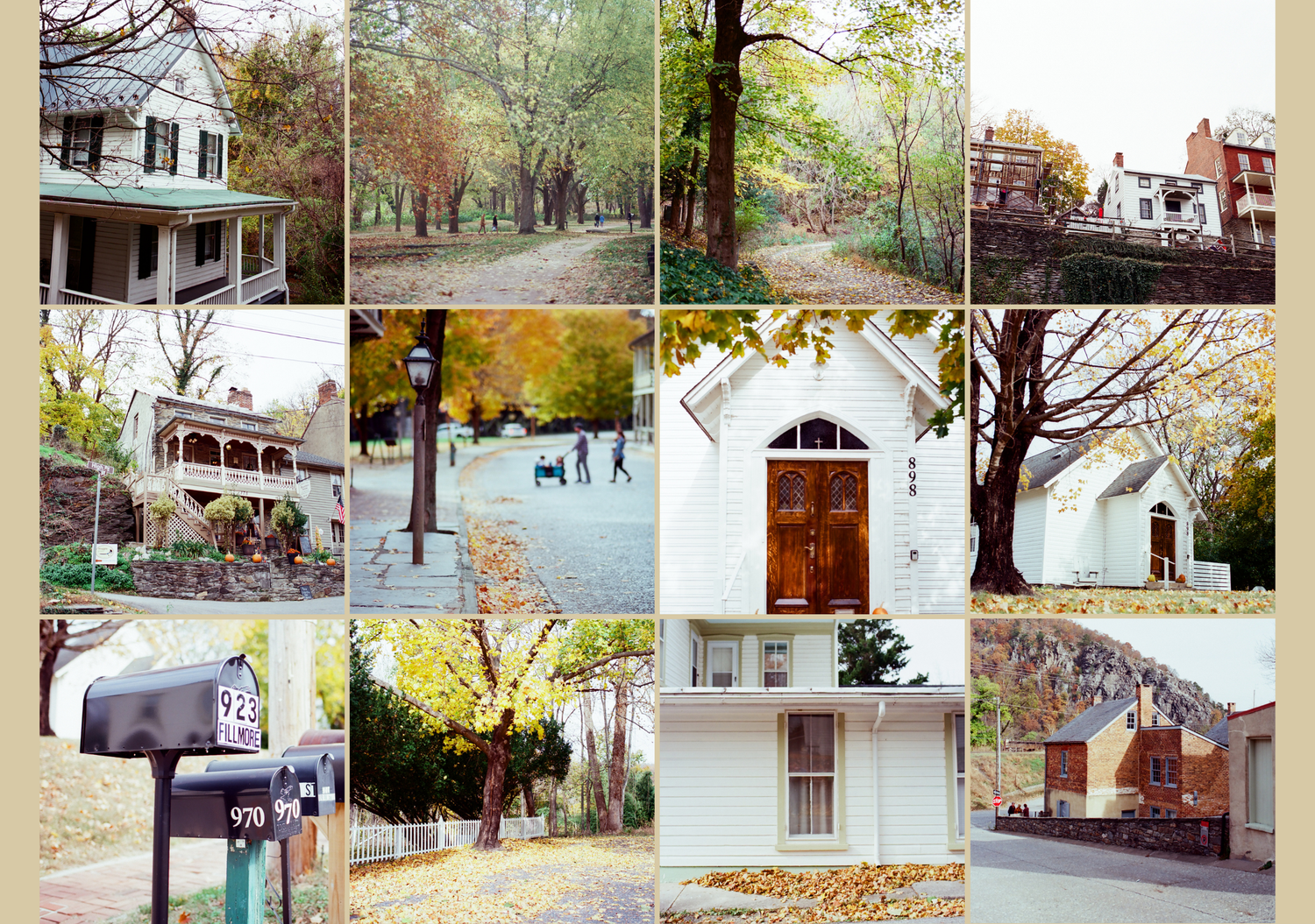
In these lab scans, Kodak Ektar 100 produced clean, vivid color with very little visible grain. The fine grain is most noticeable in the smoother areas, such as the sky and the white siding, where the images remain relatively clean instead of looking textured or noisy. Details in the brick, roof shingles, tree branches, leaves, and mailboxes also appear well defined, which fits Ektar’s reputation for sharpness and strong edge detail.
The color is boldest in the autumn scenes. Yellows, oranges, reds, and greens appear rich and saturated, while the red trash bins and warm brick stand out immediately. The film gives the photographs a polished, almost postcard-like quality, especially in scenes with foliage and architecture. At the same time, the lab scans lean fairly bright, with pale skies and light-colored buildings pushed close to white.
Contrast varies across the set. The mailbox and brick-building photographs have clearer separation between highlights, midtones, and shadows, while the white houses and brighter tree scenes look softer and more washed out. Some of that comes from the overcast or evenly lit conditions, but the scanning choices also matter. Lab scanners usually adjust each frame individually, so exposure, brightness, color balance, and contrast may not be completely consistent across the roll.
These scans also suggest that Ektar can hold strong color even when the overall image is bright. However, several highlights appear close to clipping, particularly in the sky, siding, and yellow leaves. A darker rescan or a small reduction in highlights could recover a more balanced look and give the colors more depth. Based on these lab scans, Ektar 100 feels sharp, saturated, and clean, with especially strong character in autumn landscapes, architecture, and colorful everyday details.

How the Lab Scans Compare to My Scans
Film Developing Co. Lab Scans
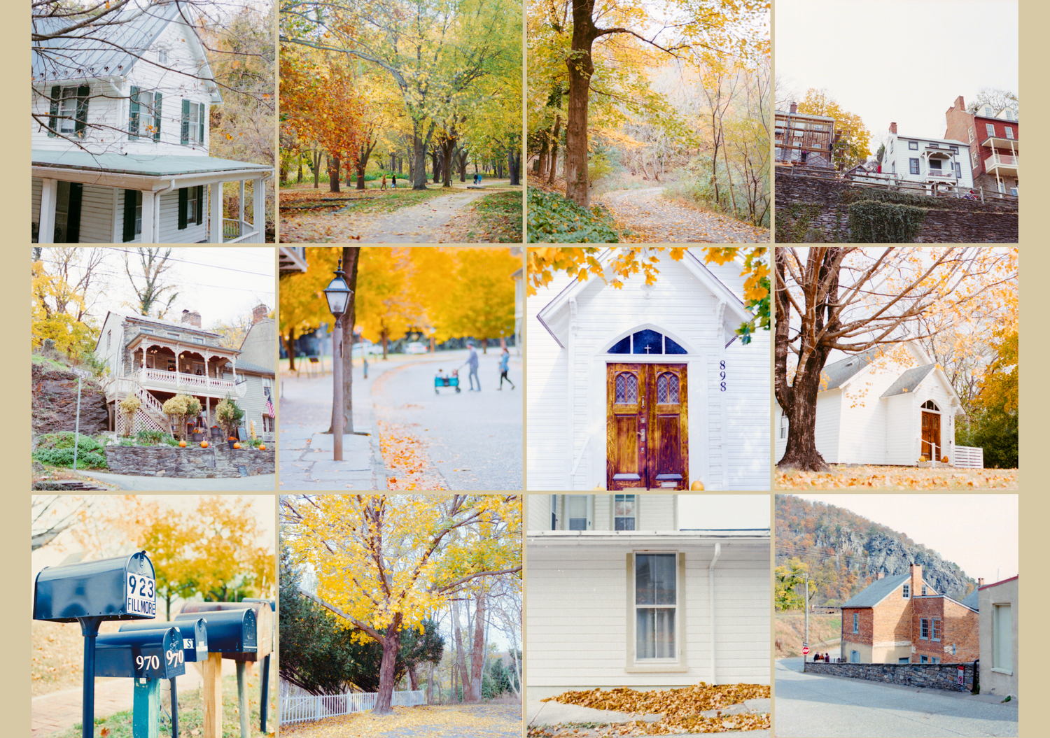
My Canon CanoScan 9000F Mark II Scans + Negative Lab Pro Edits
In the comparison above, the scans from Film Developing Co. are shown on the left, while my rescans and edits are shown on the right. I scanned the negatives with a Canon CanoScan 9000F Mark II, inverted them using Negative Lab Pro, and made additional color and tonal adjustments in Lightroom.
The lab scans look more restrained and neutral, with softer autumn colors, deeper shadows, and better-controlled highlights. My scans are warmer, brighter, and more saturated, especially in the yellows, oranges, greens, and blues. They bring out more of the bold color I expected from Ektar 100, although some white buildings and skies appear closer to being washed out.
The difference shows how much scanning and editing influence the final appearance of film. The same negative can look noticeably different depending on the scanner, inversion method, white balance, and contrast choices. I prefer the richer color in some of my scans, but the lab versions often preserve the highlights more naturally.
What I Liked
What I Disliked
- Some highlights became too bright, especially in white buildings and skies
- The film felt less forgiving when exposure was slightly off
- My scans could look overly warm or saturated without careful editing
- ISO 100 limited me to brighter conditions and slower-moving subjects
- The final look depended heavily on the scanner and inversion choices
- Some frames needed extra work to balance color, contrast, and highlights